Maybe you have a product that tastes tremendous, but few people are buying it. What’s the turn-off at the point of sale? Yikes! It could be your packaging or the product label. Without strong eye-appeal, your product could just gather dust.
Be proud of your packaging. It should do the following for your brand and for the goodness inside.
• Your Packaging Should Be Tempting. Can you see the product inside, or a fair likeness of it?

• Your Packaging Should Be Engaging. Does your packaging tell a story – whether whimsical, wise or off the wall – what is your product ‘about’?
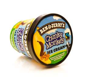
Think Ben and Jerry’s legendary ice cream. When those Vermont guys got their start, they invoked the hippie lifestyle and a down on the farm feeling via spectacular colors, outrageous lettering, a tongue in cheek creative naming of each flavor. Then they ‘topped’ it all off with an unprecedented approach to charity: 7.5% cause donation with every pint sold.
Click here for the ‘whole scoop’ on Ben and Jerry’s philanthropy over the years.
• Your Packaging Should Serve Double Duty. Sure the label is a place to learn about your product’s ingredients and its place of origin . . . but it’s also where folks discover what you stand for. Let your food flag fly!
• Your Packaging Should Be Simple. Try to keep your font variations to a minimum. Avoid any color clashes. Keep the eye focused and provide a lot of white space between the graphics and text. Most retail products could do with a streamlined and neat label.
• Finally, Your Packaging Should Be Affordable! Since you are just getting started, this is bound to be a primary concern.
Most packaging and labeling suppliers require volume orders. It’s difficult to find a vendor who will do short runs. But you don’t have buyers in the thousands. What are you to do?
 GOOD NEWS!
Leapin’ Lizard does short runs and the quality is very high. Count on us as a resource. Get your custom label printing project started — reach out to us today!
Save
Save
Save
Save
Save
Save


