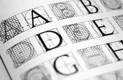
In the fast-paced world of product marketing we can get focused on the big picture and sometimes lose track of the finer details. Deciding what to say on your labels is as far as some people go. But how you say it is equally important. What font you use and how the type appears on the label are of the utmost importance. Perhaps these are minor details compared to the other things a small business has on its plate – but they shouldn’t be overlooked!
In the world of labels, your font is one of your biggest assets. Much of what you will communicate on the shelf, will be conveyed through your font. You’ve probably heard the Marshall McLuhan line: “The Medium is the Message.” Well that goes double for your labels – your font is absolutely the medium that conveys your message!
So it’s important to consider what kind of message you want to send. When considering which fonts to use for your labels, let’s look at the dual role of your typeface:
• READABILITY: it has to render the text readable — people must be able to read the label!
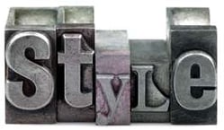
• STYLE: it has to convey more than just the text – like how reliable, stylish, delectable or inventive your product is.
It’s these two roles that help us to find the font we’ll ultimately associate with your brand and your product.
Readability
A label that is hard to read is really easy for a consumer to ignore. Difficult-to-read labels also convey that you haven’t put much thought into the design. None of this is good. And it’s not just that things should be readable when you’re holding them in your hand, they need to be eminently readable—from an angle, from a distance, and in different kinds of light.
Elements of readability include:
• Contrast: colors are important, but contrast is key. Dark text on a light background is easiest to read and any design needs to make sure that  (even for the colorblind!) the text pops off the page.
• Consistency: most good designs don’t use too several different fonts. Even more than two unrelated fonts can confuse the eye and make reading more difficult.
• Size: Be sure you use a size of font that is easy to read for all. A cluttered and small type design doesn’t encourage reading.
• Visual hierarchy: Be sure to establish consistent typefaces and styles for each element of the design. Readers should instantly see the difference between the important headings and the finer details.
• Serif or sans serif? There are two broad font types: serif and sans serif. Serif means that there are small flourishes on every letter. Generally, serif fonts give a classic feel but are hard to read when printed in small sizes. Sans serif fonts are easier to read in small sizes and give a more contemporary feel.
• Spacing: Fonts need to not only be a good size, but also have the right amount of space between lines and between text areas. A cluttered typeface design is difficult to read.
Style
 Now it’s time to consider the subtler aspects of font choice. There are new fonts coming out all the time, and there are trends that come and go. With thousands of fonts to choose from, it’s sometimes hard to decide which font is the perfect one.
Here are a couple of suggestions:
• Make a list of the attributes that you want people to read instantly about your company: established or progressive? Youthful or mature? Intelligent or exuberant? Stylish or practical? Urban or outdoorsy? Masculine or feminine? You get the idea. With these characteristics in mind, look at other, similar companies to your own and get a feeling for their fonts. This will give you a strong sense of some of your options.
• Compare some fonts that you like side-by-side. Look at the same text in different fonts so you’re not comparing apples and oranges. It’s also helpful to compare fonts using only black and white so that you can focus on the font rather than other design elements.
• Go with your instinct, but get trusted opinions. You don’t have to know why that font is just right – it can just feel right. But make sure that many other people agree, and that they think it conveys your core company attributes.
Ready to print? If you’ve settled on the best label for your products, we’d be ecstatic to print them for you. Reach out to us to get started!
Save
Save
Save
Save


