If you’re placing products on the shelf, it’s not just the quality of the product that captures your consumers. The label of your commodity may be as effective as the product itself, and it might even be more effective if you strive to attract new consumers. That’s why label and logo design is so crucial. And that’s why we’re taking some time to take a keen look at product label design, including color theory. Let’s delve into the meaning behind the various colors of the rainbow, as well as color schemes that are eye catching.
What the Color of Your Label Says About Your Product
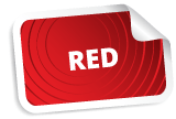
Red pops. It expresses passion and love, as well as (ironically) anger and hate. It’s one of the most loaded colors, as far as the emotions are concerned. As such, red is an excellent choice for band stickers, hot sauce and salsa labels, Valentine’s Day products, and much more.
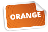
Orange is friendly and inviting. It’s associated with joy, energy, and confidence. In addition, it’s connected with innovation. Orange is a great brand color for tech companies, innovators, and others in changing industries.
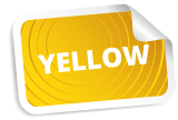
Yellow is warm, and like orange, it is a very optimistic color. It’s highly energetic, and associated with activity. Yellow is ideal for candle labels, bath and body products, honey labels, children’s products, and more.

Green is undeniably associated with nature. As such, it’s also a symbol of growth and health, as well as peace. Green is especially popular with food products (including organic goods), as well as eco friendly products. Plus, green is the color of money, which makes it a typical choice for investment firms.
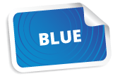
Like green, blue can be a symbol of good health, tranquility, and peace. Blue is also associated with cold, openness, intelligence, and security. Many communications corporations use blue logos for their business, and blue is a popular label color for cleaning products.
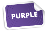
Purple signifies royalty and nobility, creativity, spirituality, and ambition. It’s an excellent color for red wine labels, and it’s a popular logo color for creative start-up businesses. Purple also represents individuality, making it a popular choice for pioneer corporations.
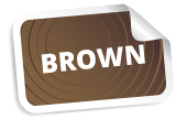
Brown brings about images of soil, making it an ideal color for earthy and organic products. Brown is a popular choice for bath products, and chocolate, coffee, and tea packaging. Brown is also a grounding color, which makes it a popular selection for companies that project dependability.
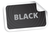
Black labels signify purity, power, and authority. They may also reflect an image of sophistication, mystery, and elegance. For clean, powerful labels, black may just be the best option. Black labels also contrast the color of a product’s packaging. Black is a common choice for liquor bottle labels, candle labels, and it’s an easy go-to for, well, pretty much every product label and logo.

Grey represents balance. It’s a well-grounded color, and it represents professionalism. This color is popular for industrial businesses, architecture firms, information based companies, and other professional corporations.

White is akin to innocence, purity, and cleanliness. White also represents perfection. Like black, white is a common choice if your packaging speaks for itself.
Mixing & Matching Colors (Color Theory)
OK, now that we’ve covered all of the colors of the rainbow (and then some), it’s time to talk about color theory. Color theory revolves around the idea that color combinations can have a variety of impacts. For instance, cool colors—your blues, purples, and greens—are more associated with calmness; yet warm colors—your oranges, reds, and yellows—are more lively colors. Let’s extrapolate on some of the main themes of color theory, to further inform your product label design.
Primary & Secondary Colors
Primary colors include red, yellow, and blue. The secondary colors are purple, orange, and green. These two color sets are highly contrasting, which can make an image impactful. In combination, red, yellow, and blue, are considered playful, vibrant colors. For this reason, they’re very common colors for children’s toys. Purple, green, and orange (our secondary colors), are a bit more subdued, yet they’re still striking in contrast, and they’ll draw the eye just as well. You can’t go wrong utilizing primary or secondary color schemes.

Complementary Colors
Complementary colors couldn’t be more different—which is to say, complementary colors are on opposite ends of the color wheel. Red is complementary to green, yellow is complementary purple, and blue is complementary to orange. Think Christmas, the Vikings, and the Broncos. Since these colors completely oppose each other, they make one another pop out. Like yin and yang, complementary colors complete each other.
Split Complementary
Now, split complementary colors are similar to complementary colors, but there’s a bit of a twist. Instead of having two perfectly opposing colors, split complementary colors have a split color, which is to say, one of the colors is split on either side of the color wheel. So, instead of purple and yellow (complementary colors), you can group purple, yellow-orange, and yellow-green (a split complementary color group). Split complementary colors pop almost as much as complementary colors, but this color grouping method provides a bit more variation.
Analogous Colors
Analogous colors are colors that are near each other on the color wheel. For instance, you’ll find yellow-green, green, and blue-green in an analogous color grouping—and you’ll find orange, red-orange, and red in another color grouping. These colors work together to form a pallet that’s intriguing and pleasing. Analogous colors are easy on the eyes.
Monochromatic
Along the same lines, you could opt to utilize a monochromatic color scheme. Monochromatic schemes rely on one color, and the shade of that color can vary. It’s a very simple color palette, and its simplicity can be eye catching.

Great Labels Sell Great Products
Our final words of advice, pick a color palette that draws attention. Pick colors that will match your product’s packaging. And utilize colors whose meanings reflect the product behind the label. You’re sure to turn heads, and move your product into the hands of your clients.
Now, once you’ve settled on a design, we’re here to make it come to life. Count on Leapin’ Lizard Labels for our product label printing services. Reach out to us to get started with a free quote from your fast, friendly label makers.