The Crowler Revolution
The aluminum can revolution happened a long time ago, but that doesn’t mean that it isn’t evolving today. Mini, regular, tall-boy, all great choices considering what an aluminum can, can pack. We have entered into a new era of aluminum portability, and more importantly, flexibility. Flexibility in terms of customization. The new iteration of the aluminum can allows patrons in taprooms across the country newfound freedom when it comes to portability. Enter the 32-oz. Crowler, and enter the Crowler machine, credit for its creation goes to Oskar Blues Brewery. Since its creation it has been replicated, sought after, and now purchased by multiple breweries across the United States. The Crowler machine takes the larger 32-oz. cans and seals them right in the taproom after being filled with any choice brew. The vision seemed quite clear when the Crowler hit the market: a smaller, more portable version of a Growler, made of pure metallic bliss, capable of keeping beer as fresh as the day it flowed from the ever-loving tap, for a longer period of time.
Clothing the Can
The Crowler revolution, aluminum can evolution, stirred the pot and hasn’t let up. New innovation always gives rise to new challenges. It is difficult to achieve desired results as brewers are faced with the question: how do we produce a label that is representative of our core beliefs and values as a brewery, while still representing the vast amount of choice that breweries provide their customers? In response, the label industry has seen breweries take the bull by the horns, wrestle it to the ground, and slap beautiful labels on it. The Crowler label poses a specific challenge: it must represent the entire brewery in what typically amounts to a single image. The label may also include customization options so patrons are able to mark which beer they had sealed away in their prized Crowler, especially if things start getting a little fuzzy (thank you scrumptious beer #3). Admittedly, a naked aluminum can has all sorts of mysterious intrigue, it just isn’t capable of communicating to a customer what a brewery is all about like a finely tuned label though. In consideration of a gorgeous Crowler label, many different qualities were analyzed when piecing together this list of some of the best Crowler labels from across the country. We took into account the complete composition of each label, looking not only at the bigger picture, but also the finite details only found from staring lovingly at each label for hours on end. We hope you enjoy the visual Crowler exposition that follows. *Cheers*
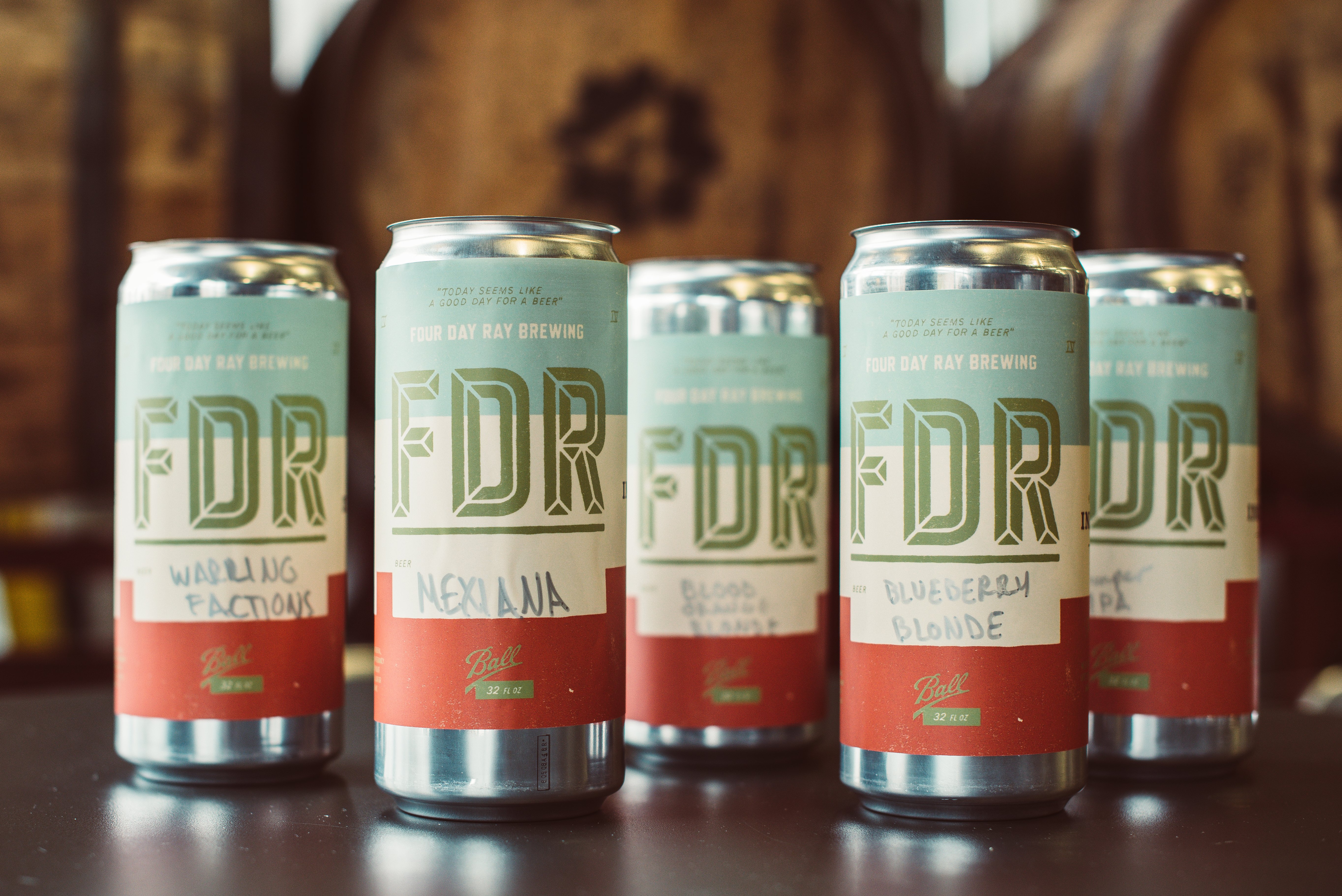 Four Day Ray Brewing – Fishers, Indiana
Design Credit: Pivot Marketing
What Caught Our Eye: Unique Color Palette
We are going to go on record and say that this color palette is one of the most warm and inviting that we came across in our search for amazing Crowler labels. One of the most important aspects of making a good first impression is balancing colors that play off one another’s strengths. We are smitten with the warmth of the blue, and how the burnt sienna red plays it cool. Not to be dismissed, the off-white palate cleanser in the middle draws all aspects of the label together, and that creates a cohesive structure that begs to be filled with superb brews. The green and bold FDR makes a dramatic statement, and along with the repeating FDR along the side, this brewery doesn’t let you forget who they are and what they are about: strong scrumptious brews, poured from gorgeous receptacles.
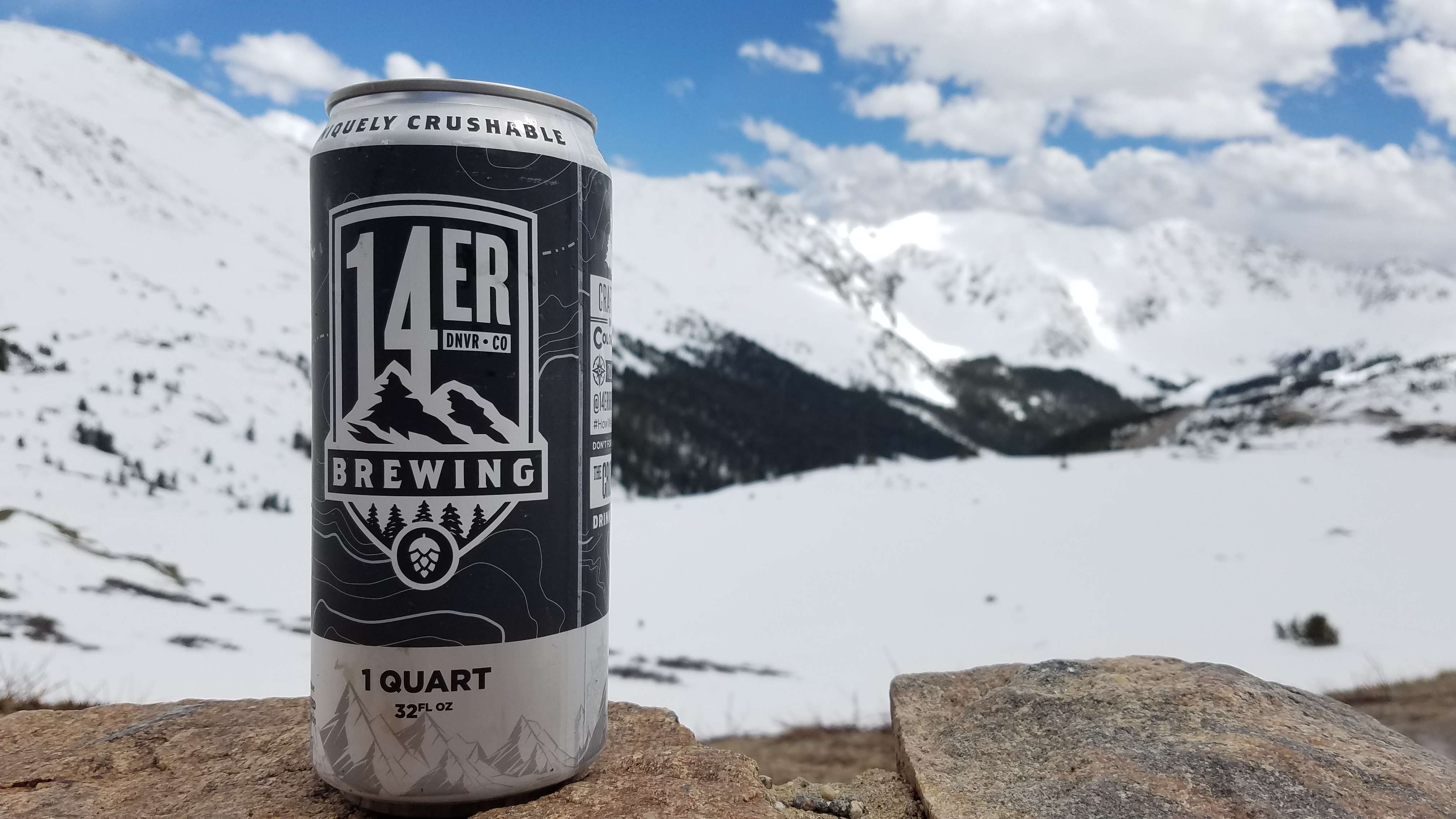
14ER Brewing Co. – Denver, Colorado
Design Credit: Shane Harris
What Caught Our Eye: Bold Contrast
Color either makes visuals pop or not, and the same could be said for contrast. The detailed and darker background provides a nifty change of pace for the white lettering that cascades down the front of this beauty. The use of topography lines provide depth for a label that is truly representative of elevating its craft beer game. Topography aside, we must mention the finely stenciled-in mountain range at the bottom of the can; it is in these finer details that the label truly sets itself apart. 14ER Brewing isn’t afraid to place itself on top of the mountain with this design that gives us the feeling that we just reached the peak. Our reward is to crack open a fresh 32-oz. brew to either share with the people around us, or to enjoy by oneself, whichever motivates you to reach the top.
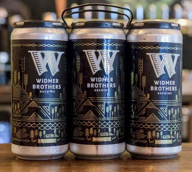
Widmer Brothers Brewing – Portland, Oregon
Design Credit: Sasquatch Agency
What Caught Our Eye: Landscape Lines
Finite detail comes to mind immediately when gawking over this well crafted label. It reminds us how simple lines can create a balanced and striking image. The finite details don’t give everything away at once, and that is what truly makes this a beauty to behold. The longer you gaze upon the golden peaks and valleys, the more intricacies are revealed. The black backdrop also provides the depth necessary to let the gold luster shine through, it gives off the feeling that this 32-oz. gem is truly something to be treasured.
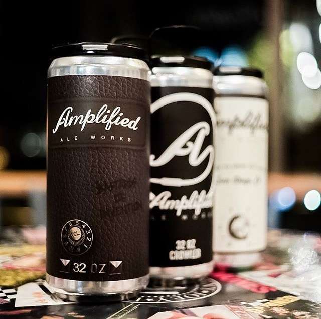
Amplified Ale Works – San Diego, California
Design Credit: Aubree Miller
What Caught Our Eye: Texture
Amplified Ale Works developed a complex Crowler label by using simple, yet effective, design choices. What sets this Crowler label apart from others, is the brilliant use of a textured background that produces somewhat of a 3D effect. There is no other feeling quite like carrying around a solid 32-oz. amp as you are walking out the door, complete with your choice of any of their delicious brews. The black and white lettering is well balanced, while the energetic, yet elegant font, makes us feel like we are swaying back and forth at a concert. This is one Crowler we’d happily ask an encore for.
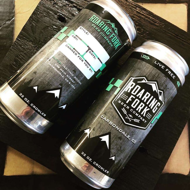
Roaring Fork Beer Company – Carbondale, Colorado
Design Credit: Shawn McGlothan
What Caught Our Eye: Depth and Substance
The Roaring Fork Beer Company recently unleashed their very own Crowler machine on the lucky citizens of the Roaring Fork Valley, and fortunately for us they decided to clothe their Crowlers in a magnificent charcoal gray that bolsters the flashes of color that encircles the label. Visually speaking, this is a thoughtful and well designed label, as the charcoal background compliments the repetitious mountain peaks at the top and bottom of the label, which leads to noticeable depth amongst the black, white, and gray scheme. If you have an extra moment, squint at the label, and you’ll start to see miniscule and complimentary graphics depicting mountains, rapids, and paddles that match the same images found in their logo. They dressed their Crowler up just to let you know that you can dress yourself down, kick off your shoes, and as the label indicates “Live Free” 32 ounces at a time.
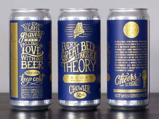
Theory Brewing Co. – Wells, Maine
Design Credit: 12 Line Studio
What Caught Our Eye: Showmanship
Theory Brewing is on a mission with this Crowler label, like a magician about to perform a trick, this Crowler speaks to showmanship. Any good showman knows how to captivate an audience, and with gold and blue wrapping smoothly around one another, this label grabs hold of our attention without letting go. The idea of getting down to business can be daunting when it comes to labels and design; Theory Brewing has taken the business side of things to a new level with its dazzling blend of colors and artisanal text. We are easily drawn in with the Crowler’s outside presentation. The text is just as important as the visual composition here, as the label promises us a delicious potion awaiting inside its chambers, perhaps by alchemy. This label reminds us that every beer, at one point or another, is purely conceptual. Keep those concepts coming, because we are drawn in and can’t wait for more deliciousness.
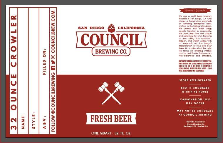
Council Brewing Co. – San Diego, California
Design Credit: Charles Eck – http://www.callmechuck.com/
What Caught Our Eye: False Mirror Color
The inverse of color is an incredibly attractive feature that this Crowler label possesses. Red and white is a classic combination, and this label from Council Brewing Co. demonstrates how versatile these two colors are when working together. The flash of red in the white space, and the flash of white in the red space provides a poignant note that fresh beer resides in the receptacle, and letting it go to waste would be unjust. The text is effectively bold where it needs to be, providing incentive to fill the Crowler up, if only to later, throw it down or slowly knock it back.
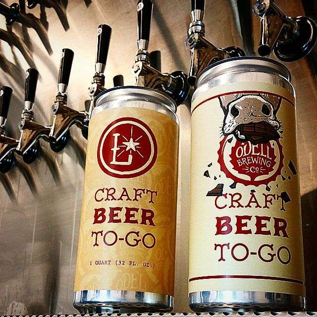
ODell Brewing Co. – Fort Collins, Colorado
What Caught Our Eye: Cartoon Craftsmanship
We can’t not mention the giant, full bodied nostrils at the top of the can, it just wouldn’t be fair to the genius behind this label. The cow at the top, chomping on chocolate, may seem odd to some, but before second guessing the brews inside, I recommend looking up the backstory behind ODell’s very own brew Lugene. The warm colors here work great together, just as mentioned before. The red and white hues are symbiotic, and as we see a little bit of orange work its way in, we start to see the repeating ODell logo, and a label with layers (backstory included) is always welcome in our books.
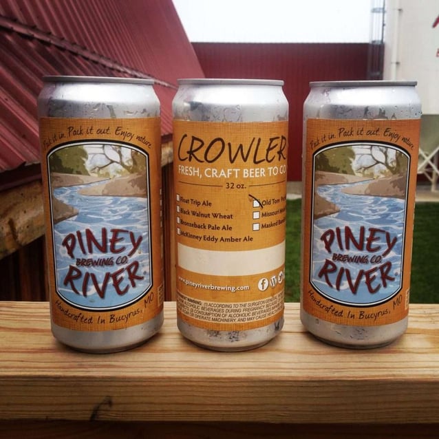
Piney River Brewing Co. – Bucyrus, Missouri
Design Credit: Grindstone Studio
What Caught Our Eye: Imagination
This Crowler label has our attention for multiple reasons. The warming orange hue that wraps around a picturesque scene, along with easy customization options, demonstrates Piney River Brewing’s commitment to getting out and enjoying what the world has to offer. No, you’re right, there are no canoes present in the Crowler label, and nobody coasting lazily down the river on a sun baked, lazy afternoon. We can imagine those possibilities with this label though, and that is truly what counts here. With this carefully crafted Crowler label, we are introduced to a colorfully serene scene that melds adventure with adult beverages. All we need is a canoe underneath us and a couple Crowlers attached firmly to our crafts, and we’d be ready to take to the gentle rapids.

Need Crowler labels? We’ve go you covered! Contact us today, for the best Crowler pricing around! Cheers!