While there may be multitudes of people that are familiar with your products, your labels must remain recognizable and they ought to be clear and captivating to catch the eyes of new clientele. That means that you’ll need a label that has striking clarity. What do we mean by that?
Well, think about it like this: When you stroll the aisles of your grocery store, do you recognize certain brands instantaneously? What about products that you’ve never purchased before: Do some of them pop out more than others? Labels with coherent branding, color schemes, and overall legibility prove successful, while labels that lack clarity fade into the masses. So how do you make your brand stick? How do you make your label stick out? Let’s address those questions with a number of tips that are designed to help you improve your label clarity to win the eyes of onlookers and passersby.
Consider Non-Photorealistic Rendering or Graphic Art
While some may be tempted to create a label with a photo image or a complex graphic, simplicity serves an important role in the world of product labels. Instead of using a highly detailed image of your logo, it’s more powerful to utilize a logo that is somewhat “toon-shaded.” Toon shading (or “cel shading”) is a technique (most commonly used in video games) which transforms a three-dimensional image into a more two-dimensional-looking image. Gradients are transformed into a series of singular colors and tones, making the image appear flatter, yet more striking and contrasting. Shadows are flattened and simplified, making three-dimensional objects legible, even at a distance. This technique is pleasing to the eye, and it aids in making a label more expressive, and more clear. If you have a three-dimensional graphic in mind or a photo image that you’d like to use for your product label, non-photorealistic renderings of that image or graphic will be more appealing to clients, both new and returning.
Contrasting Colors and Tones
Similarly, you can achieve clarity through high contrast. Consider designing a label that features contrasting colors (colors on opposite sides of the color wheel), and contrasting tones (like black and white). This contrast makes an image pop, lending excitement to a label. This technique can help to earn the attention of those who are looking to try your product for the first time, and this method helps those who have already tried your product to recognize the label as they’re shopping. Let’s take a wine bottle label, for instance: While a sprig of purple grapes may be the logo that you’ve settled on, that emblem may be more successful, compelling, and striking if it were set against a yellow backdrop (since yellow contrasts purple). Perhaps you can have the green stem of these hypothetical grapes resting against a red sky backdrop to make the composition even more attractive.
The same goes for the tones or shading of the colors of your labels. Place dark colors against bright, vibrant colors to lend more power to each of them. Consider a dark, rust orange backdrop behind bright robin’s egg blue text for your shampoo labels. Or perhaps you are making hot sauce labels; go with big, bold, black Helvetica font on a white label with a small habanero pepper logo. Your sauces will fly off the shelf like hotcakes.
Text Clarity
Speaking of fonts, your text is as important as the artwork for your product label. First thing’s first, you’ll want to ensure that your text is legible. While you may be tempted to go with a cursive font (which can be successful in some instances), a standard font will prove more readable. That’s important if your products are on the shelves alongside dozens of other competing products, especially if shoppers are walking by, glancing at labels, and picking a product quickly.
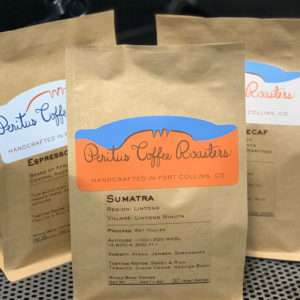
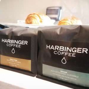
At the same time, you can (and should) seek out a font that fits the “flavor” or character of your product. As we mentioned, Helvetica is bold — a great choice for products associated with strength, power, courage. Baskerville, on the other hand, looks proper and authoritative. This option may serve well for products that should look sharp and smart — perhaps packaging for health food or coffee. Didot is a timeless font that works with everything from beer bottles to soap labels. You can even invest in creating your own unique font to truly encapsulate the character of your products.
Get a Proof Before You Commit
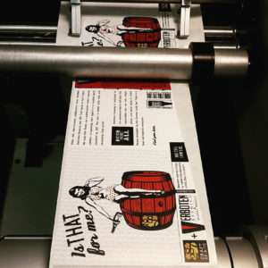
This rule really applies to all printings that you purchase: You should get a proof before you commit to a full printing. Regardless of how much care and time you put into the design of your label, you can’t be certain of the final product until you have it in your hands. That’s especially true for label printing, since you have so many label materials to choose from, and each material will have its own sheen, paper color, and texture. Be sure to get a proof of your labels before you commit to a full order. That way, you can make tweaks to your design to improve the clarity and overall appeal of your label before you have dozens or hundreds of them roll off the printer. That’s just one of the many benefits of working with Leapin’ Lizard Labels; we provide free proofs on all of our projects, so that you can be certain you’re satisfied with the final product before we produce all of your prints.
Take the Leap
Have you finalized your artwork? Well we’re eager to take over from here. We here at Leapin’ Lizard Labels would be ecstatic to print off labels for your products. With fast turnarounds, free prints, and inexpensive pricing regardless of the number of product labels that you need, there’s really only one choice for all of your custom label, sticker, and banner printing needs. Get started with a quick quote for your project, or feel free to reach out to us if you have any questions about our printing process!