Flavor Enhancer
Picture for a moment, the flawless blend of pure and fresh ingredients that results in the enhancement of almost any flavor. In other words, the creation of one of the most important food toppers known today: hot sauce. Hot sauce takes on the awesome responsibility of taking old flavors and making them new again, delightfully adding unique character and taste to the everyday foods we have come to love. No, it isn’t a requirement for hot sauce to burn holes through your tongue on its way down to burning several more holes through your stomach, and so on. As stated, it isn’t a requirement, but it sure can be fun sometimes, just head over to YouTube and type in ‘Hot Sauce Food Challenge’ and you’ll see what we mean. Through the pain and tears, there is an underlying beauty in the complexity of hot sauce, from the process of blending ingredients, to the decorative labels that catch your attention, it all culminates in experiencing what could only be described as a deliciously smooth, slow burn.
Dressing the Sauce
We expect hot sauce to enhance the foods that we have come to love; to make them new again. Hot sauce tangles with our taste buds in a vibrant and intricate dance, which provides for us tasty new experiences. Just as important as the hot sauce itself, is the label that represents the hot sauce and its attributes. From coast to coast, and beyond, hot sauce companies have found truly incredible ways to show off the contents within their bottles. From playing off the natural colors of the hot sauce itself, to simplistic designs showcasing the beauty of the ingredients that give the hot sauce life, these are some of the most eye-catching labels that we have uncovered in our search. We hope you enjoy the visual hot sauce exposition that follows. *Cheers*
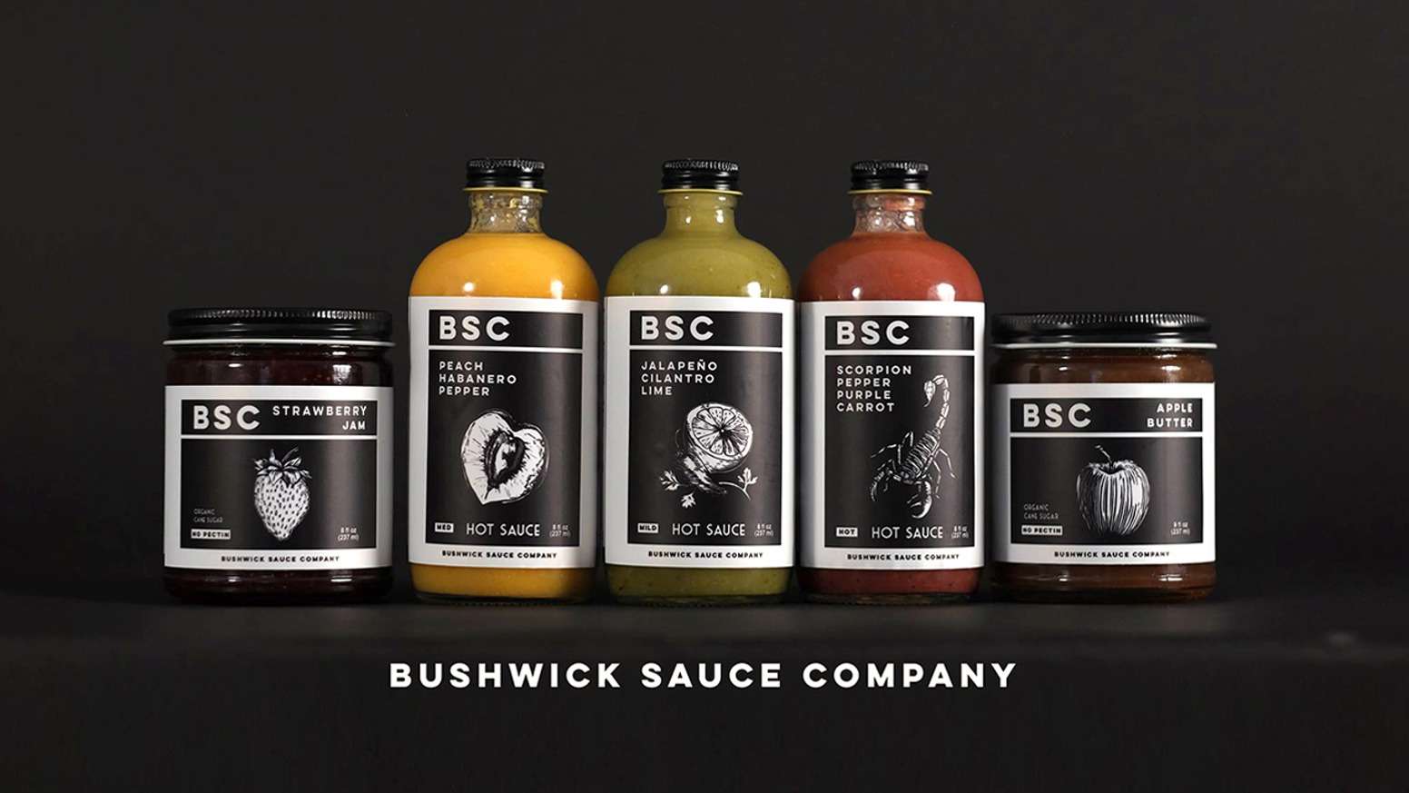 Bushwick Sauce Company – Brooklyn, New York
Design Credit: Adam Brawerman and Irma Sierra
What Caught Our Eye: Contrast & Realism
The black and white profile accomplishes several things with this amazing label that we found from the Bushwick Sauce Company. Not only does it demonstrate the artistic talent behind the designer, it lets the color of the hot sauce showcase itself as a brightly illuminated background, punctuated by the possibility of palatable flavors. After some digging, we discovered that Irma sketched the designs, while Adam carved them out in linoleum before being printed. This is an incredible process to see, and you can find short snippets of it on their website. In relation to the design itself, we are impressed by the realism staged in the center of the label, as our eyes are drawn immediately to the intricate and illustrative ingredient design. To be clear, we don’t believe there were any actual scorpions that went into the making of their hot sauce. We did find that the design is representative of the scorpion pepper, which is exceptionally spicy, yet incredibly versatile, all the more reason to give it a go. Bushwick Sauce Company stands out from the rest with their distinctive black and white labels and realistic illustrations, and for that we commend them.

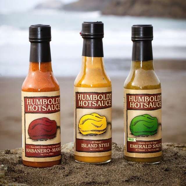
Humboldt Hot Sauce – Arcata, California
Photo Credit: Amy Kumlar, Designer: Scott Cocking
What Caught Our Eye: The Bold and the Beautiful
In the label world, it’s just not possible to say enough about color. This label has bold colors, and bold colors done right. It’s difficult to achieve depth with color alone, and as we see it, this label has visual layers created by dark borders and bright colors. The all-caps lettering shines through the bold base of color. This is where design choice plays an integral part in making sure that the customer is left with a lasting impression, as the name of the company and the style of sauce is easily recognizable. First impressions matter in the world of hot sauce, especially when shelves are stacked with the competition. We couldn’t leave this sauce behind without mentioning the bold and flavorful pepper illustration that takes center stage on the label, it’s design work like this that makes our mouths cry out for a taste.
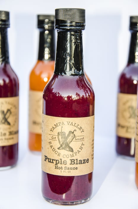
Yampa Valley Sauce Company – Steamboat Springs, Colorado
Design Credit: Katie Henry – https://bluerth.com
What Caught Our Eye: Classy Presentation
The size of the label matters, and it’s a true balancing act between showcasing the sauce, and communicating where the sauce came from, which includes both location and ingredients. Like a high-wire act, Yampa Valley Sauce Company has balanced a classy label with a hot sauce comprised of vigorous colors. Almost as if their imagery is etched into the label itself, the hand drawn images provide a sense of authenticity. Authenticity from their label’s perspective demonstrates that this company values producing a product that is thoughtfully crafted and artistically designed. If their sauce is representative of their label, then we can trust their hot sauce to be a balanced explosion of flavor.
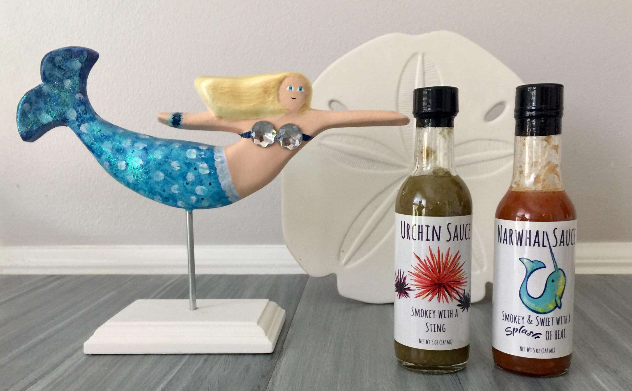 Hilltop Hot Sauce Company – Virginia Beach, Virginia
Design Credit: Hilltop Hot Sauce Company
What Caught Our Eye: Neat and Clean Hand-Drawn Beauty
We were drawn to this label from Hilltop Hot Sauce as soon as it appeared on our screen. Our eyes immediately fell to the hand drawn narwhal and the refreshingly soft colors that are filled within its emboldened lines. The imagery is surrounded by a playful, yet professional font that encapsulates the heart of this hot sauce company and their product. We also love the choice they made to separate the word ‘splash’ from the rest of the verbiage on the label to build around the beachy theme. The change in font is an excellent representation of a visual onomatopoeia, one that engages the taste buds by sight alone, and we can just imagine how awesome the sauce inside must be. In contrast to the Narwhal Sauce, the Urchin Sauce has a visually striking presence, and once again the beachy theme comes through with poignant wordplay. It can be difficult to pull off an all-white background, but Hilltop has blended their label elements together seamlessly to create a label that showcases their imagery and playful text in the best way possible.
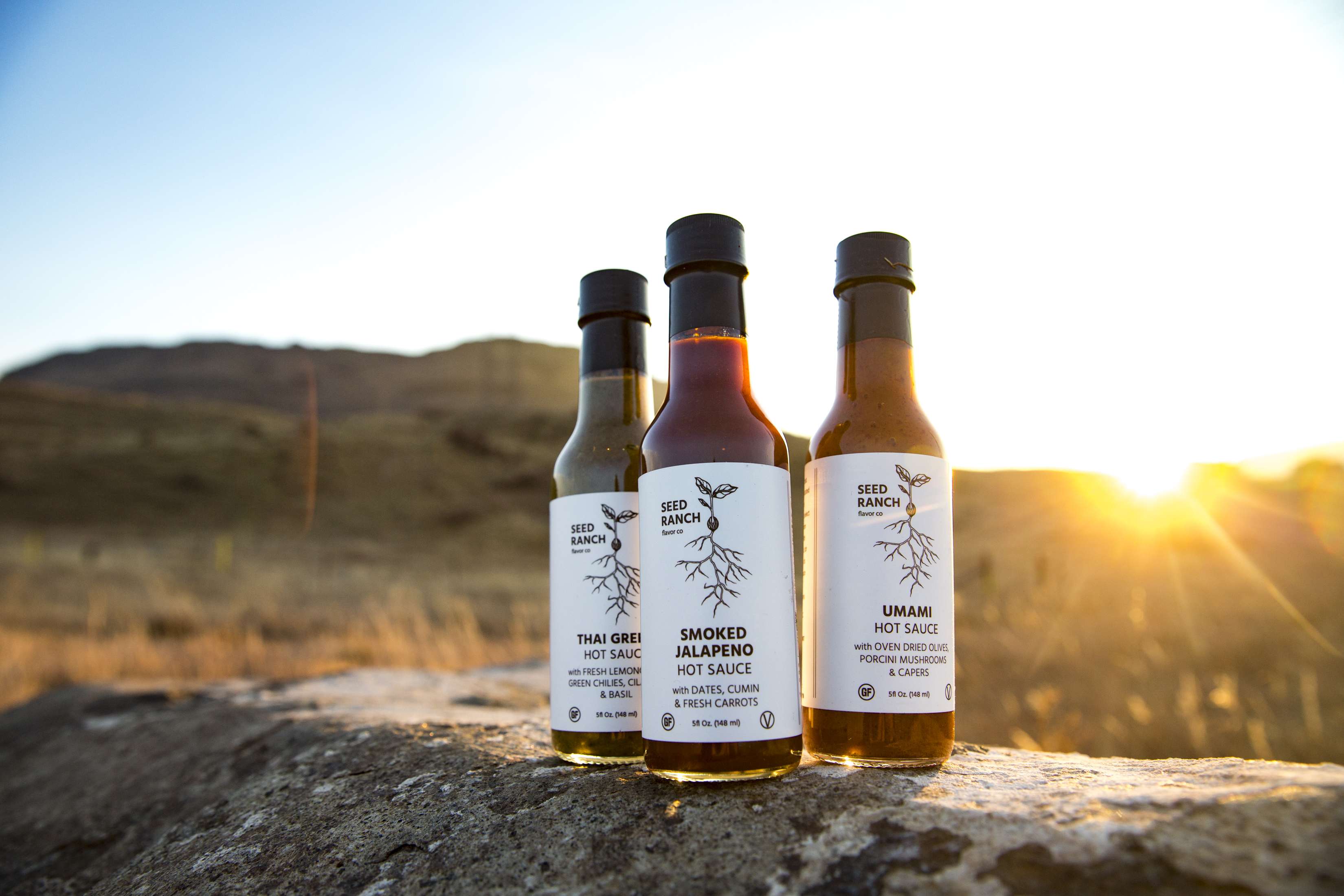
Seed Ranch Flavor Co. – Boulder, Colorado
Design Credit: Josh Ivy – http://ivymakesthings.com/
What Caught Our Eye: The Iceberg Effect
We like a label that shows it all off, especially when done through simple, yet effective, design choices. We forget at times the intricate beauty of plants themselves, as we focus primarily on the finished product: the produce that plants produce. Seed Ranch Flavor Co. takes a moment to remind us that without strong roots, the potential for tasty sauce would never be possible. The black and white design elements allow the color of their hot sauce to become the backdrop to their straightforward approach. The iceberg effect reveals that underneath the name of their company, and the style of sauce, there is a foundation of unique ingredients, that when combined, create a truly one-of-a-kind taste experience.

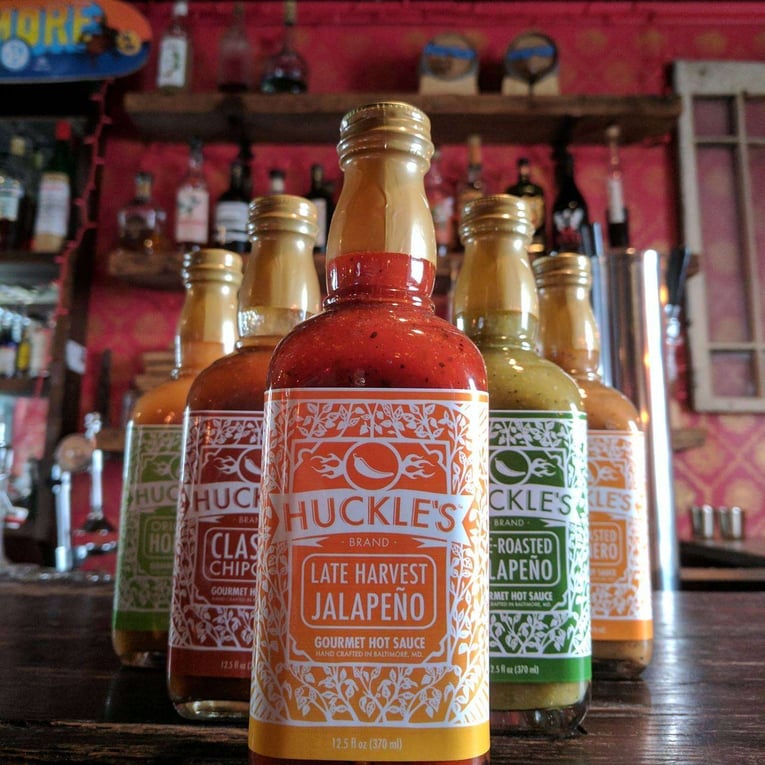
Huckle’s Gourmet Foods – Baltimore, Maryland
Design Credit: Annie Howe – http://www.anniehowepapercuts.com
What Caught Our Eye: Impressive Intricacy
Wandering stems and branches envelop the outer regions of this label, cascading upward producing a striking effect on the lettering and the imagery in the middle of the hot sauce bottles. Take a moment to focus on the center of the label, and you will witness the depth this label possesses, as the tangle of leaves and stems weave an intricate background that forces the image in the center into the spotlight. It seems that the vibrant colors of the labels have been chosen carefully to work in harmony with the color of the sauce, letting the fresh ingredients encased show off all that they have to offer. Working with hot sauce labels, this is a theme that comes up time and time again, and it showcases just how thoughtful a company can be about their product. We are smitten with the banner that highlights Huckle’s name, and the simple and straightforward approach to the text below that describes each type of sauce inside the bottles. Just like the vines, the design work here makes us want to wrap our hands lovingly around these hot sauce bottles, if only to hold it close to let it loose.
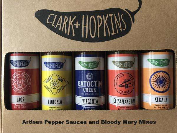
Clark + Hopkins – Winchester, Virginia
Design Credit: Gary McHatton
What Caught Our Eye: Regional Representation
When we came across these labels we were instantly intrigued by the possible composition of the sauces inside, and that is directly associated with their incredible label design. Each sauce seems to be representative of a specific region, and the ingredients found there. This is an impressive idea, also impressive is their approach to wrapping their sauces in finely tuned and inviting labels. The background colors stand out, yet they don’t call attention away from the imagery in the center of the labels, in fact, it feels as though the colors bolster the visuals. The white banners at the top and bottom of the labels provide a boundary that helps develop depth within the label itself. As we gaze upon their labels, we get the sense that everything is interconnected within each bottle of sauce, and it is within these intentional choices that we find a hot sauce company willing to go the extra mile to create a truly unique visual experience.
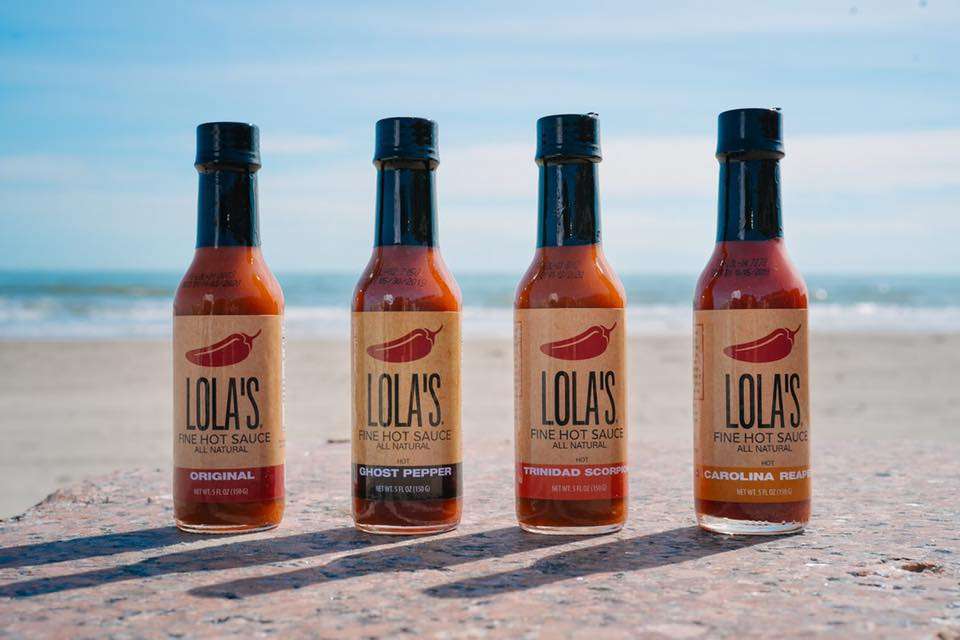
Lola’s Fine Hot Sauce – West Des Moines, Iowa
Design Credit: Taufeek Shah – Founder of Lola’s Fine Hot Sauce
What Caught Our Eye: Cohesive Structure
The label from Lola’s Fine Hot Sauce is incredibly intriguing. When we first caught a glimpse of it, it definitely stood out to us, but we couldn’t figure out exactly why. Everything is pieced together harmoniously, as the labels are clear, crisp, smooth, subtle, and easy on the eyes. After we got over our adjective obsession, we realized the underlying commonality that these labels possess is within the structure of the labels themselves. From the base of vibrant color upwards, the label is a cohesive blend of color and text, leading to the simple, yet appealing, image of a red pepper resting at the top. Lola’s has developed a label that sneakily grabs your attention just long enough to get you wondering about the delicious possibilities within their bottles. We can say that, without apprehension, Lola’s didn’t skimp on the essentials of an effective label: consistency and cohesion.
Need custom Hot Sauce labels? We’ve go you covered! Contact us today, for the hottest deals! Cheers!