As times and styles change, so do consumers’ desires, and companies have to keep up. Some put out new products, and some keep the classics, but more often than not, rebrands can enhance your brand’s story and help you stay up to date. Here are some examples of rebrands we think were successful:
Apple
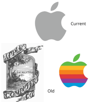
One of the sleekest brands out there today is Apple, but it wasn’t always that way. The original Apple logo resembled the cover of classic literature more than anything that would make you think of modernization. The second Apple logo introduced the current fruit-shape and displayed a rainbow of colors that some speculate inspired the app icon colors for early iOS softwares. Now the logo is a simple silver apple dawned on all current mac products to symbolize knowledge and gives the impression of minimalistic futurism.
Dunkin’
This one may have gone unnoticed to some, but Dunkin’ has actually completely dropped donuts from its name! The brand’s colors are mostly the same, but what is fascinating here is that this company has made such a lasting impression in consumers’ minds that dropping an entire word from the name wasn’t confusing! This tactic definitely wouldn’t work with most companies.
BP
BP dropped its old shield logo for a colorful burst called the Helios and a lowercase font. Not only is the new logo more aesthetically pleasing, but is meant to better represent the many different parts working together for one large company.
Google Maps
If you’ve ever gotten your Google Maps and your Apple Maps applications confused, you’re not alone. Recently, Google redesigned the Google Maps application icon to be a single pin with the signature Google colors. This design looks much better, but more importantly makes the app easier to find!
Midol
Midol changed a lot about their branding in 2020. The first time we saw it on store shelves, we had to do a double take. They exchanged the outdated blue for a more feminine feel and modernized their font by unitallicizing it. A large M dawns the front of their packaging now. They’re hoping these changes will appeal to a younger generation.
Burger King
Some have pointed out that the current Burger King logo is reminiscent of a logo they had in the eighties. With vintage coming back in style, this take on an older logo and use of seventies-style fonts might not be a bad idea. The new logo has been simplified to look like a burger, and their bold, in-your-face campaigns tend to appeal to younger consumers.
CIA
The Central Intelligence Agency may seem like an unexpected player here, but the drastic change had to be mentioned. The old logo looks much like other government agencies. The new logo could be something out of a Sci-fi show’s opening theme, but it looks much sleeker and stands out from other government logos. This is probably one of the most radical logo changes we’ve seen.
Mastercard
Mastercard’s signature red and gold venn diagram has also seen several changes throughout the years. The most recent update removed the lines interconnecting the circles and simplified the font to a lowercase sans serif. Their hope is to increase clarity among modern digital payment platforms. We think this is their best look yet!
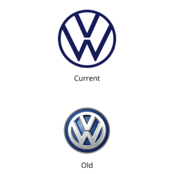
Volkswagen
While Volkswagen kept the main linework in their logo forming the VW, they modernized their circular design by making it two-dimensional and reducing the colors. The company’s goal is to make it easier to use this logo in the digital world, and also represent their movement into a more electric focus.
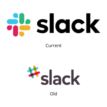
Slack
Slack has been through several rebrands over the years, but the recent one seems to be the most current. Their many takes on the hashtag logo has now taken the form of a burst with a similar color scheme. Their goal in this was to bring uniformity and cohesion to their content.
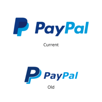
Paypal
Paypal is one of the largest payment service providers in the world. Keeping similar colors, they modernized the logo with less negative space and a sharper font. They even provide a place on their website where you can source their logos and buttons with the current branding for your business needs.
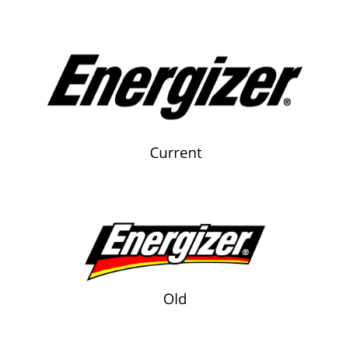
Energizer
Energizer’s rebrand moved the focus to their mascot: the energizer bunny! He’s now more realistic and animated than before, and the packaging is centered more around him than the words now. The tagline has also been shortened to “Still going!” This is a good example of a brand growing with its consumers.
These are just a handful of the many rebrands that have taken place over the years. Whether it’s a new font, brighter colors, or a complete overhaul of your brand, rebranding is a great way to ensure a company’s longevity in the minds of consumers.
