Good labeling sells beer. And good beer sells more beer. At Leapin’ Lizard Labels, it’s our goal and intent to draw the eye to your delicious brew with labeling that boldly displays your brand and the logo that captures the character of the sweet suds behind the label. That’s why we’re talking about good label design in today’s article. Let’s get to it!
Simple Sells
If you’re starting a label design from scratch, there are two roads to follow: You can take the simple road, or you can take the complex road (and there’s an argument to be made that you can take both); each path has its own distinct opportunities. Let’s take a keen look at simple design first, followed closely by design with complexity.
Simplicity
In a comical TED Talk entitled, Why city flags may be the worst-designed thing you’ve never noticed, a speech-lecture given by Roman Mars, we learn the argument for simplicity. In this TED Talk, Mars spends about 18 minutes divulging common idealisms in flag design, as well as five basic rules — established by the North American Vexillological Association (NAVA) — for good flag design (Vexillology is, by the way, the study of flags.).
Mars points out that NAVA’s good-flag-design rules are as follows:
1) “Keep it simple: The flag should be so simple that a child can draw it from memory.”
2) “Use meaningful symbolism.”
3) “Use two to three basic colors.”
4) “No lettering or seals: Never use writing of any kind.” [This one doesn’t really apply to beer bottle design theory.]
5) “Be distinctive.”
Mars follows up, stating, “If you showed this list to almost any designer of almost anything […] all these principles apply to them too.” In short, good design should be simple, meaningful, basic, legible, and distinctive. That sounds like sound advice, right?
I say sure, that’s relatively sound advice. Good eye-catching design could easily include all of those things: Meaning, yes. Distinction, of course. Et cetera.
The Complexity Argument
Now, there’s one major caveat to the aforementioned rules, and Mars does address that caveat: Flags (unlike beer bottles) are meant to be distinct and legible from afar. Can you recognize the American flag flying over that Ford dealership a mile away? Sure. Can you recognize the Colorado flag on the gentleman’s shirt at the bar across the room? Absolutely. What about the beer he’s holding? Well, maybe… maybe not.
A beer bottle is on a different scale than a flag… It fits in your hand. You hold it very near to your eyes. Thus the canvas that is the beer bottle label affords us the opportunity to be complex. That’s good news for brewers and designers.
So where’s the balance? Do you go all out with a complicated bottle label? Perhaps a label with watercolor washes that form smooth color gradients and a detailed image. Or maybe you’re thinking about designing a label on the level with Gustav Klimt’s painting, Adele Bloch-Bauer I (If you don’t know the painting, let me Google it for you.).
Well, there’s no black-or-white answer to that question. However, here’s our two cents: There’s beauty in a bit of both. You can have a bottle that’s bold, simple, and recognizable from afar (which is great branding), yet it’s also complex and captivating up close. Simplicity and complexity, ironically, aren’t mutually exclusive.
So, back to the aforementioned hypothetical man at the bar (the one in the Colorado t-shirt). With a good beer bottle label, you — an innocent bystander — instantly recognize the brand even from across the room (It happens to be the bright red lettering of a delicious craft brewery.). At the same time, the man with good taste in beer and t-shirts can’t stop staring at the complex mosaic of fractalized green hops tessellating across the beer bottle label in his hand. The simple red lettering boldly compliments the complex green hops. And voilà, you have a smoldering hot label that’s sure to sell your frosty cold brew.
Design Several Iterations
Now that we’ve delved, in depth, into the depths of the deeply debated simple v. complex debate, it’s on to far easier, less-tongue-tying advice: Design in iterations. While you may be tempted to pick the first design that you draft up, there’s value in taking the time to draw several iterations. After all, it’s not likely that you’ll stick to the first design that comes to mind, especially after you’ve accumulated 20+ possible labels.
Play around with the colors of your label. Would rusted orange be a better fit than bright brick red? Next, take a fresh look at the lettering. Arial® is a bit boring, and Comic Sans® is right out (On a side note, who knew that Comic Sans was copyrighted?). Maybe Rockwell® font? Yes, Rockwell will do nicely. What about the shape of the label? Circles are in right now. But you’re always pressing ahead of the curve… An octagon will do wonderfully for your purposes. Border or no border? OK, you know best.
Creating iteration after iteration will get the creative juices flowing, and it’ll prove to provide you with the best label for your delectable brew. You’ve spent so much time crafting those incredible suds; why wouldn’t you dedicate as much care to your label?
Picking the Right Material
Finally you’ve honed in on a final beer bottle label design. Each octagonal, eggplant-purple-bordered label will feature orange Rockwell lettering and avocado-green hops. It’s the perfect design for your throwback IPA. Kudos! The hard stuff is out of the way. Next, you’ll just have to pick the right label material. Here are our recommendations: Estate #9, or White BOPP (which is appropriately short for biaxially oriented polypropylene film). If you’re a small-time craft brewer, sharing small-batch brew after small-batch brew with friends, stick to Estate #9; this label paper comes off easily in a hot-water soak, so you can reuse those glass bottles.
If you’re a commercial brewer, opt for our White BOPP label material. It’s our most water-resistant label, making it ideal for bottles that will inevitably gather condensation when they’re pulled out of the cooler.

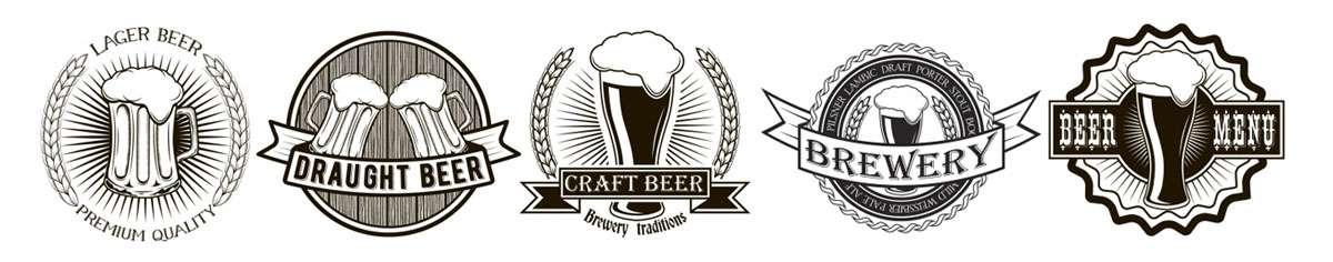
Leapin’ Lizard Labels’ Beer Labels
Here at Leapin’ Lizard Labels, we provide a slew of different label types for a variety of companies, including local companies here in Colorado and sprinkled across the nation. We’re proud to support our local brewers (Northern Colorado is the Napa Valley of beer after all.), and any of our comrades that produce delicious brews. We’re also proud to support both big commercial brewers, and those who’re just experimenting in their garage — that’s why we provide label printing in any size. Learn more about our custom beer label printing services! Take note, we print labels for beer bottles, beer taps, crowlers, and more!